
Guidelines
Intelligence,
made visible.
The single source of truth for the Synerise visual language — the system behind every screen, campaign, and touchpoint of an AI-native customer platform.
How we introduce the company.
The official Synerise boilerplate — the paragraph that closes a press release, a partner announcement or a conference bio. Paste it as it is in the market's own language. It is approved corporate wording, so the figures in it are fixed: never re-base them on numbers quoted elsewhere.
About Synerise
Synerise is a company developing its own AI and Big Data platform, which enables the automation of business processes based on the analysis of behavioral data. Every day it supports more than 500 deployments of its systems in 49 countries on six continents. The platform's clients and partners include brands such as: Carrefour, H&M, Ikea, JD, Nike, Pepco, Empik, InPost, Orange, Rossmann, dunnhumby, VTEX, Deloitte, PwC.
The Synerise platform is responsible for more than 3 billion autonomous AI-supported decisions a day, and its proprietary Big Data systems handle more than 225 billion queries a month. The company's solutions are regularly recognized in the world's most prestigious artificial intelligence competitions.
Synerise also makes its technologies available through open source projects such as Cleora, and supports educational initiatives related to AI, remaining one of Europe's pioneers in the development and practical application of artificial intelligence.
www.synerise.com
Acerca de Synerise
Synerise es una empresa que desarrolla su propia plataforma de IA y Big Data, que permite automatizar procesos de negocio basados en el análisis de datos de comportamiento. Cada día da soporte a más de 500 implementaciones de sus sistemas en 49 países de seis continentes. Entre los clientes y socios de la plataforma se encuentran marcas como: Carrefour, H&M, Ikea, JD, Nike, Pepco, Empik, InPost, Orange, Rossmann, dunnhumby, VTEX, Deloitte, PwC.
La plataforma de Synerise es responsable de más de 3000 millones de decisiones autónomas asistidas por IA al día, y sus sistemas propios de Big Data gestionan más de 225 000 millones de consultas al mes. Las soluciones de la empresa reciben premios con regularidad en los concursos de inteligencia artificial más prestigiosos del mundo.
Synerise también pone sus tecnologías a disposición de todos en el marco de proyectos de código abierto, como Cleora, y apoya iniciativas educativas relacionadas con la IA, manteniéndose como uno de los pioneros europeos del desarrollo y el uso práctico de la inteligencia artificial.
www.synerise.com
Sobre a Synerise
A Synerise é uma empresa que desenvolve sua própria plataforma de IA e Big Data, que permite automatizar processos de negócios baseados na análise de dados comportamentais. Todos os dias, dá suporte a mais de 500 implementações de seus sistemas em 49 países de seis continentes. Entre os clientes e parceiros da plataforma estão marcas como: Carrefour, H&M, Ikea, JD, Nike, Pepco, Empik, InPost, Orange, Rossmann, dunnhumby, VTEX, Deloitte, PwC.
A plataforma Synerise é responsável por mais de 3 bilhões de decisões autônomas apoiadas por IA por dia, e seus sistemas proprietários de Big Data processam mais de 225 bilhões de consultas por mês. As soluções da empresa são premiadas regularmente nos mais prestigiados concursos de inteligência artificial do mundo.
A Synerise também disponibiliza suas tecnologias em projetos de código aberto, como o Cleora, e apoia iniciativas educacionais relacionadas à IA, permanecendo como uma das pioneiras europeias no desenvolvimento e na aplicação prática da inteligência artificial.
www.synerise.com
O Synerise
Synerise to firma rozwijająca autorską platformę AI i Big Data, która umożliwia automatyzację procesów biznesowych opartych na analizie danych behawioralnych. Każdego dnia wspiera ponad 500 wdrożeń swoich systemów w 49 krajach na sześciu kontynentach. Wśród klientów i partnerów platformy znajdują się takie marki jak: Carrefour, H&M, Ikea, JD, Nike, Pepco, Empik, InPost, Orange, Rossmann, dunnhumby, VTEX, Deloitte, PwC.
Platforma Synerise odpowiada za ponad 3 miliardy autonomicznych decyzji wspieranych przez AI dziennie, a jej autorskie systemy Big Data obsługują ponad 225 miliardów zapytań miesięcznie. Rozwiązania firmy są regularnie nagradzane w najbardziej prestiżowych konkursach poświęconych sztucznej inteligencji na świecie.
Synerise udostępnia również swoje technologie w ramach projektów open source, takich jak Cleora, oraz wspiera inicjatywy edukacyjne związane z AI, pozostając jednym z europejskich pionierów rozwoju i praktycznego wykorzystania sztucznej inteligencji.
www.synerise.com
We build the intelligence layer for customer growth.
Synerise unifies behavioral data, AI and automation into one real-time platform. Our identity has to feel as precise, calm and capable as the product — enterprise-grade, human-centered, unmistakably intelligent.
One wordmark. Applied with discipline.
The Synerise wordmark is the constant across every touchpoint. Its geometric letterforms are never redrawn, restyled, or reproportioned.
xxMaintain clear space equal to the cap-height (x) of the wordmark on all sides.
Never reproduce the wordmark below 72px wide on screen or 24mm in print.
Graphik. One family, every voice.
A single geometric sans carries the whole system — from 132px display to 10px overline. Weight and scale do the work; we never mix in a second typeface.
Four principles guide every decision.
One system, every surface.
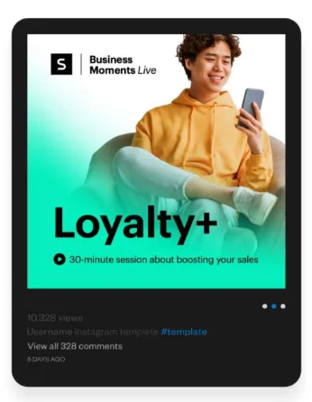
The same tokens carry from a social square to a trade-show wall. Drop real imagery into the frames to see it come alive.

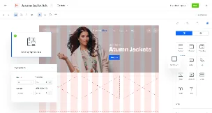
The system, fully expressed.
Long-form with a point of view.
Ebooks, case studies, and articles share one editorial grammar: a strong kicker, a confident headline, a readable measure, and pull quotes that carry the argument.
How a unified profile lifted repeat purchase by 34%.
The team replaced twelve disconnected tools with a single real-time layer. Within one quarter, decisioning moved from overnight batches to sub-second, and every channel finally spoke the same language.
Columns hold at a comfortable 60–75 character measure. Body is Graphik Regular at 15–17px with 1.7 line-height for sustained reading — denser than product UI, calmer than a landing page.
Section kickers use the mint overline. Numerals are tabular so figures align in tables and stat runs. Links use deep mint and underline on hover — never mid-sentence decoration.
“We stopped guessing. The platform tells us what to do next — in real time, for every customer.”
Composable blocks, assembled with intent.
A handful of reusable layout patterns cover most needs — drop them in, keep the spacing, change the content.


Every mark, ready to place.
Master artwork for Synerise and the brands built around it. Take the vector file wherever you can — SVG for screen, PDF for print — and reach for PNG only when nothing else will do.





Clear space, minimum sizes and the things never to do to these marks are set out in 04 · Logo System and 20 · Do & Don't. Need a lockup that isn't here? Ask the brand team rather than redrawing one.
Our offices, cleared for publication.
Press photography of the Kraków headquarters, approved for editorial use. Full-resolution WebP, shot in daylight, unretouched. Take the whole set or the single frame your story needs — no permission request, no waiting on a reply.
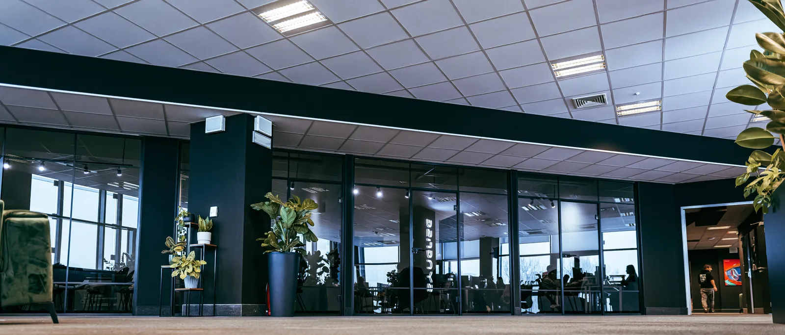
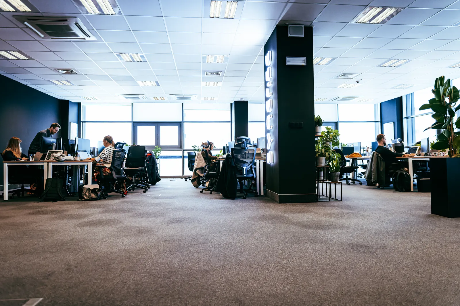
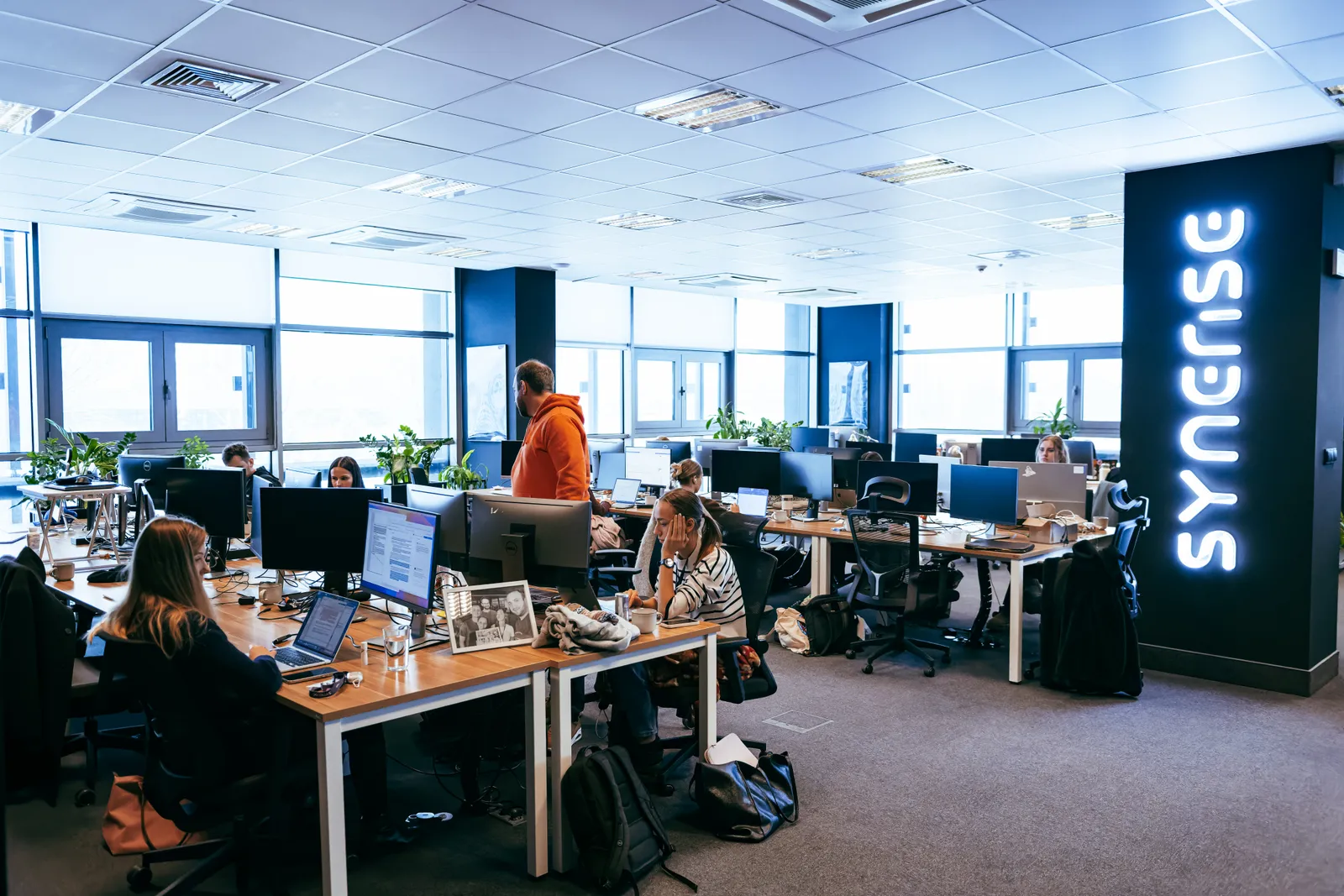
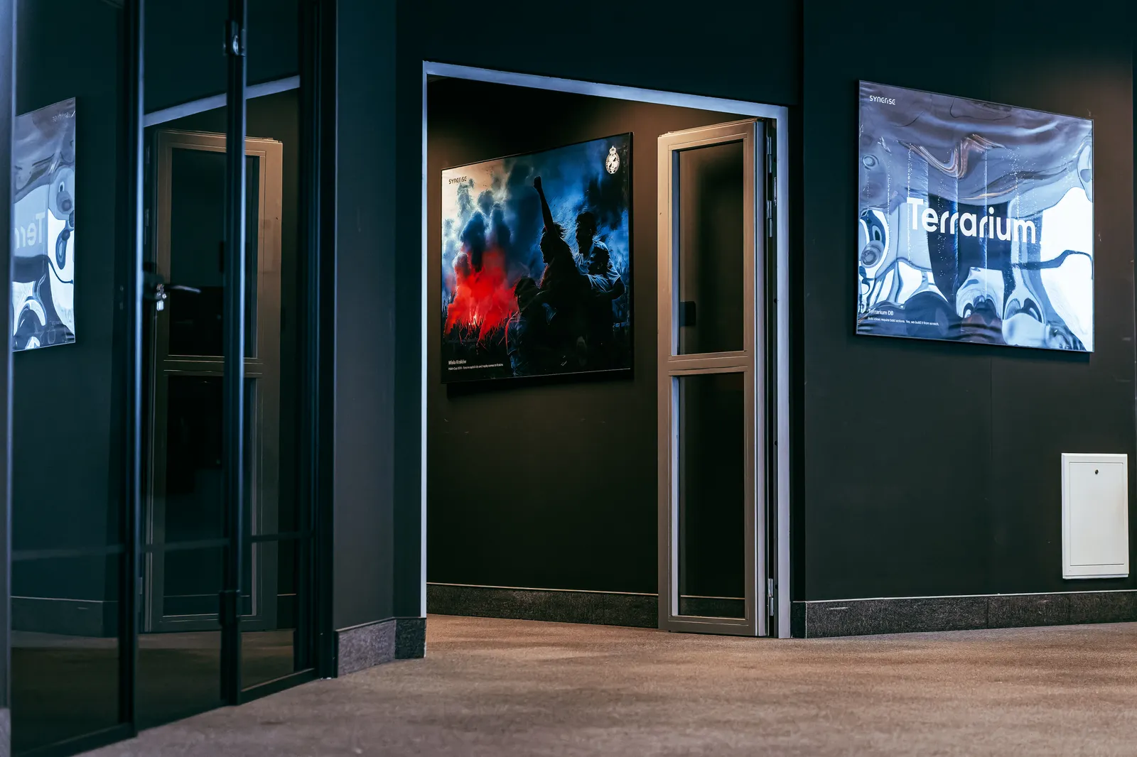
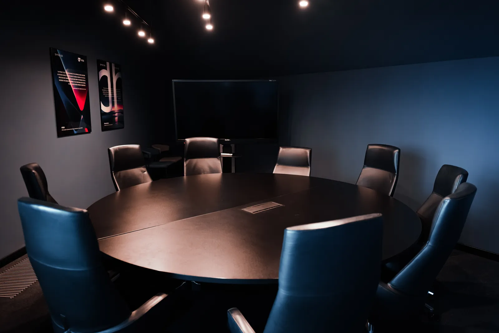
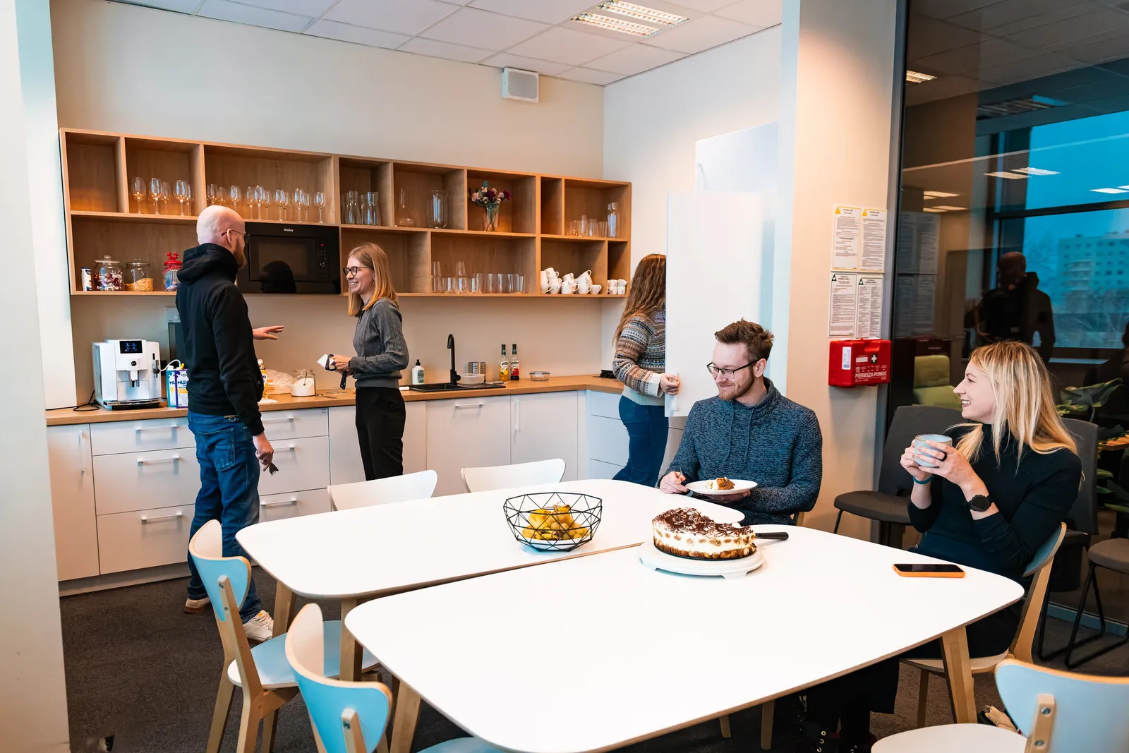
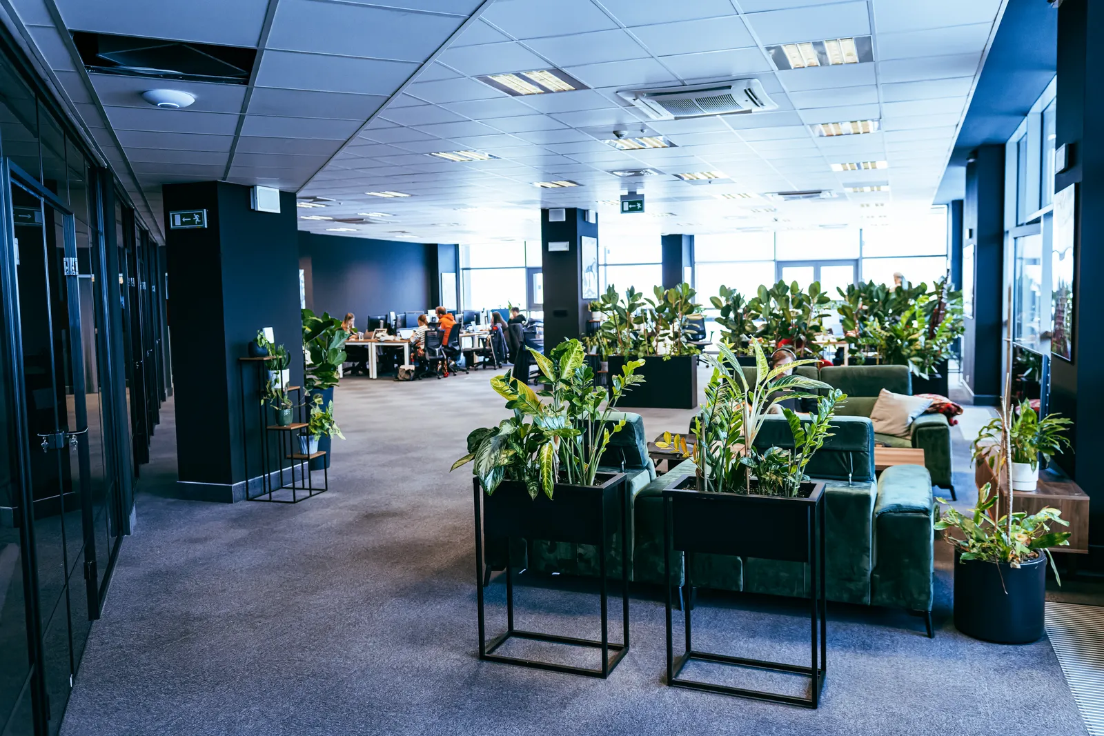
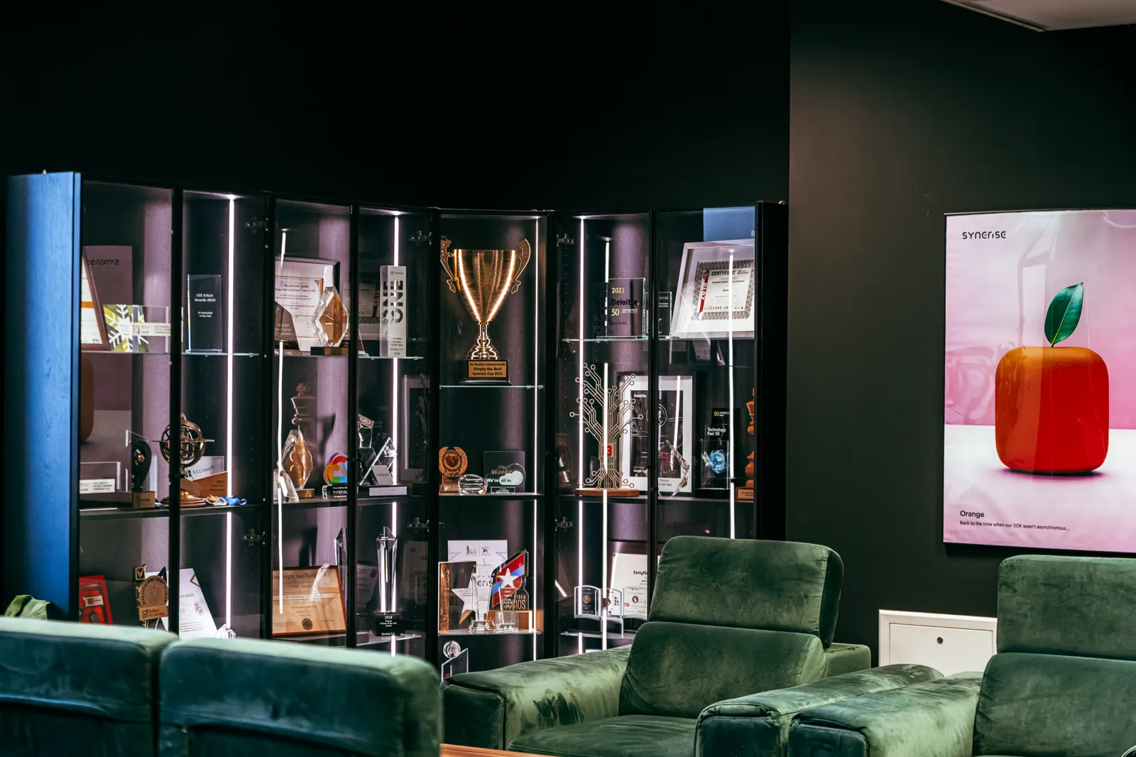
Credit them to Synerise. Crop freely, but leave the colour as shot — the grade is part of the direction set out in 15 · Photography. Company boilerplate for the copy around them is in 02 · About. Need a portrait, a product shot or a photo of another office? Ask the press team rather than lifting one from social.
The palette is fixed. This is the one thing we never change.
Ten hues, ten steps each. Mint leads; ink and warm greys carry the weight; accents are used sparingly and with intent.
Gradients blend mint with ink or teal. Reserved for hero moments, never for text or UI chrome.
Color is a signal. The more neutral the canvas, the louder a single mint moment reads.
The visual signatures that say Synerise.
A small kit of recurring devices — a data mesh, connective nodes, gradient fields, and precise dividers — extend the brand beyond the logo.
Square brackets frame key figures and callouts.
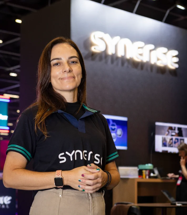
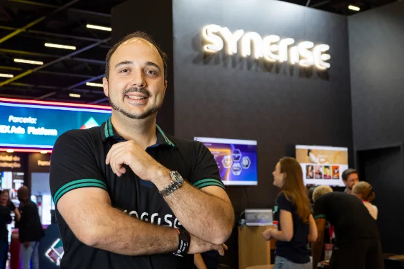
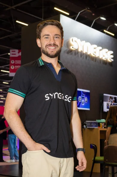
Real people. Natural light. Quiet confidence.
Photography keeps the enterprise human. Candid moments over staged stock, soft daylight over hard flash, and generous negative space that lets a single subject breathe. Drop your approved imagery into the frames below.
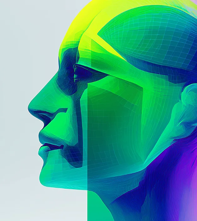
Spot illustration for meaning. 3D for moments.
Flat, multi-color spot illustrations explain concepts in empty states and onboarding. Sculpted 3D renders — in brand hues on neutral grounds — headline campaigns and launches.
Fast, functional, never decorative.
Motion confirms and guides — it doesn't perform. Short durations, a single easing curve, and one signature ripple on interaction.
Charts that read at a glance.
Data is the product, so charts get first-class treatment. One fixed color order keeps every series consistent across the platform.
Web · Meta & Open Graph
Every public Synerise URL carries a complete meta set. The share card is often the first brand touchpoint — treat the Open Graph image as a designed asset, never an auto-generated screenshot.
Preview every release in the LinkedIn Post Inspector, Facebook Sharing Debugger and Slack before shipping. Bust caches by re-scraping after any image change.
<title>Behavioral AI Platform | Synerise</title> <meta name="description" content="Turn behavioral signals into real-time predictions, personalization and automation — on one platform."> <link rel="canonical" href="https://synerise.com/platform"> <meta property="og:type" content="website"> <meta property="og:site_name" content="Synerise"> <meta property="og:title" content="Behavioral AI for real-time growth"> <meta property="og:description" content="…same as description…"> <meta property="og:url" content="https://synerise.com/platform"> <meta property="og:image" content="https://synerise.com/og/platform.png"> <meta property="og:image:width" content="1200"> <meta property="og:image:height" content="630"> <meta property="og:image:alt" content="Synerise — behavioral AI platform"> <meta property="og:locale" content="en_US"> <meta name="twitter:card" content="summary_large_image"> <meta name="twitter:site" content="@synerise"> <meta name="theme-color" content="#232936">- Design OG images on navy #232936 or mint #00FFBC — one accent circle, white logo, one short line
- Keep text inside the 8% safe margin; verify legibility at 300 px wide
- Give campaign landing pages their own OG image and description
- Serve images as static PNG/JPG under 300 KB from a stable URL
- Ship product screenshots, dense charts or full paragraphs as og:image
- Reuse the homepage card on every page, or leave og:image blank
- Stuff titles with keywords or exceed 60 characters
- Point og:url at redirects or URLs with UTM parameters